READING NOTE
A clear column, generous paragraph spacing, and no competing motion. The essay should feel quieter than the index.
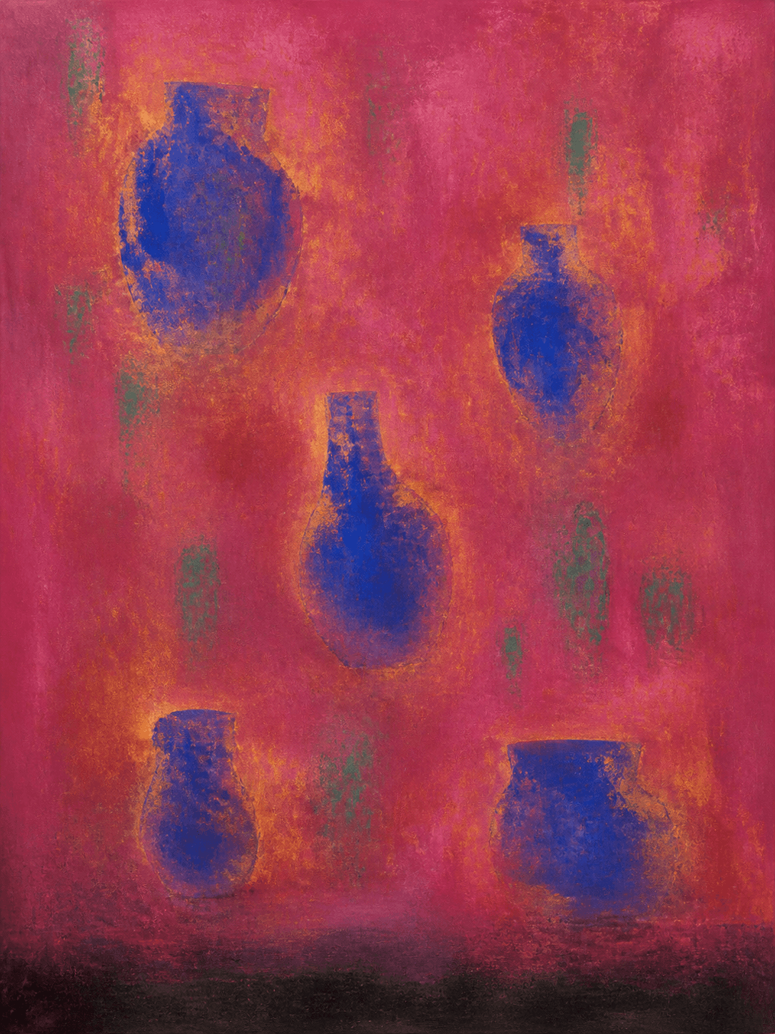
A white gallery is often mistaken for a neutral container. In practice, white is a highly active color whose temperature changes across the day. It can pull yellow from a gold passage, cool a red field, or make a dark blue painting appear almost luminous.
Digital presentation has an equivalent problem. A full-white interface leaves nowhere for weak spacing to hide. Type weight, line length, image scale, and the rhythm between captions become the architecture of the experience.
For VÉRAI, the interface avoids decorative color so the work retains chromatic authority. Hairline rules give structure without forming boxes; generous margins establish pace; captions remain close enough to belong to their paintings.
Minimalism is successful when it makes looking easier, not when it removes useful information. Dimensions, medium, condition, and availability remain close at hand because discretion should never become opacity.